Case study · Product Design
belajar investasi
An investment-education app and responsive website for working adults who are curious about investing but don't know how to start.
- Role
- Solo UX designer, concept to delivery
- Timeline
- March – April 2022
- Platform
- Mobile app; responsive website for desktop and tablet
- Methods
- Interviews, paper and digital wireframes, lo- and hi-fi prototypes, usability study, accessibility, IA
- Outcome
- Participants called it useful, especially the online classes, virtual investing and stock and gold data.
Problem
People with their own income are interested in investing, but don't really understand how to start.
Goal
An app that teaches investing and builds familiarity before people put money in.
01
Understanding the user
I interviewed working adults in two groups, 25–34 (early working age) and 35–44 (mid working age), following Bappenas’s age bands. They were interested in investing but either weren’t ready, or had already tried it because it was trending without really understanding it. Both groups wanted an app and a website that would teach them to do it properly.
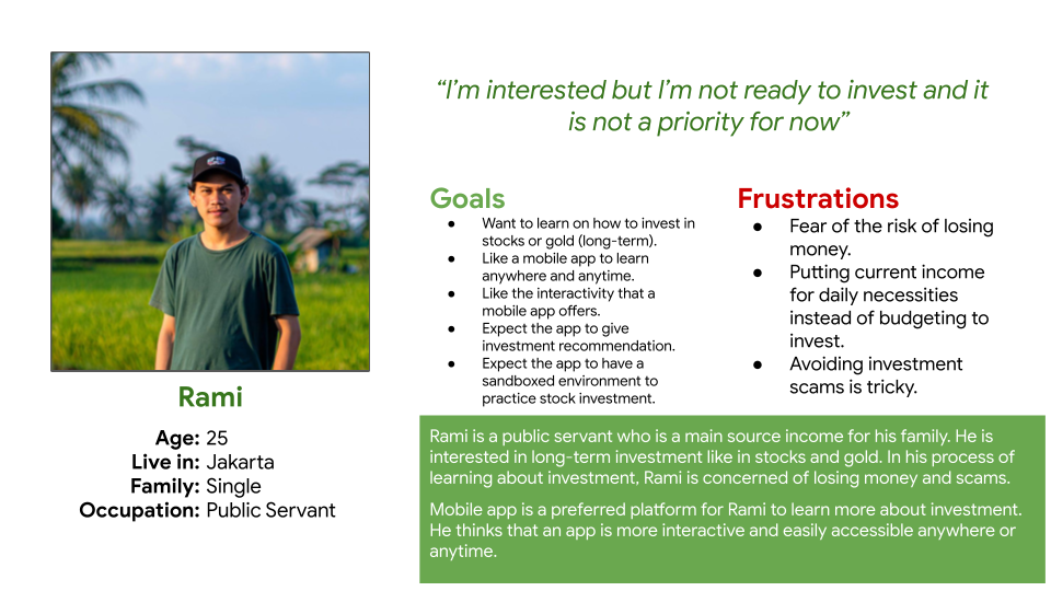
Persona · Rami
His family depends on his income. He wants to learn long-term investing in stocks and gold through a mobile app, then put money into trusted stocks and gold once he’s ready.
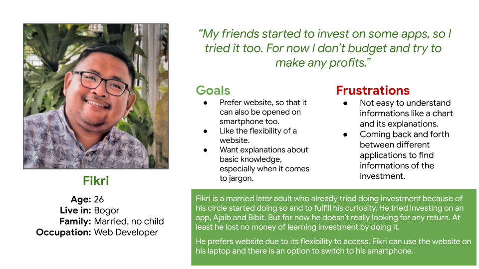
Persona · Fikri
Married and working. He needs a website that explains the basics and the industry jargon, because reading charts across several apps is hard.
02
Starting the design
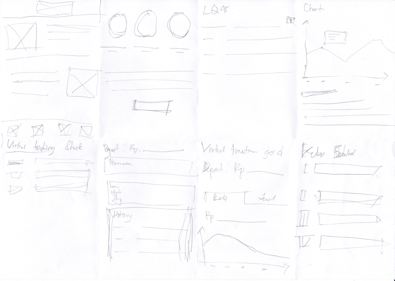
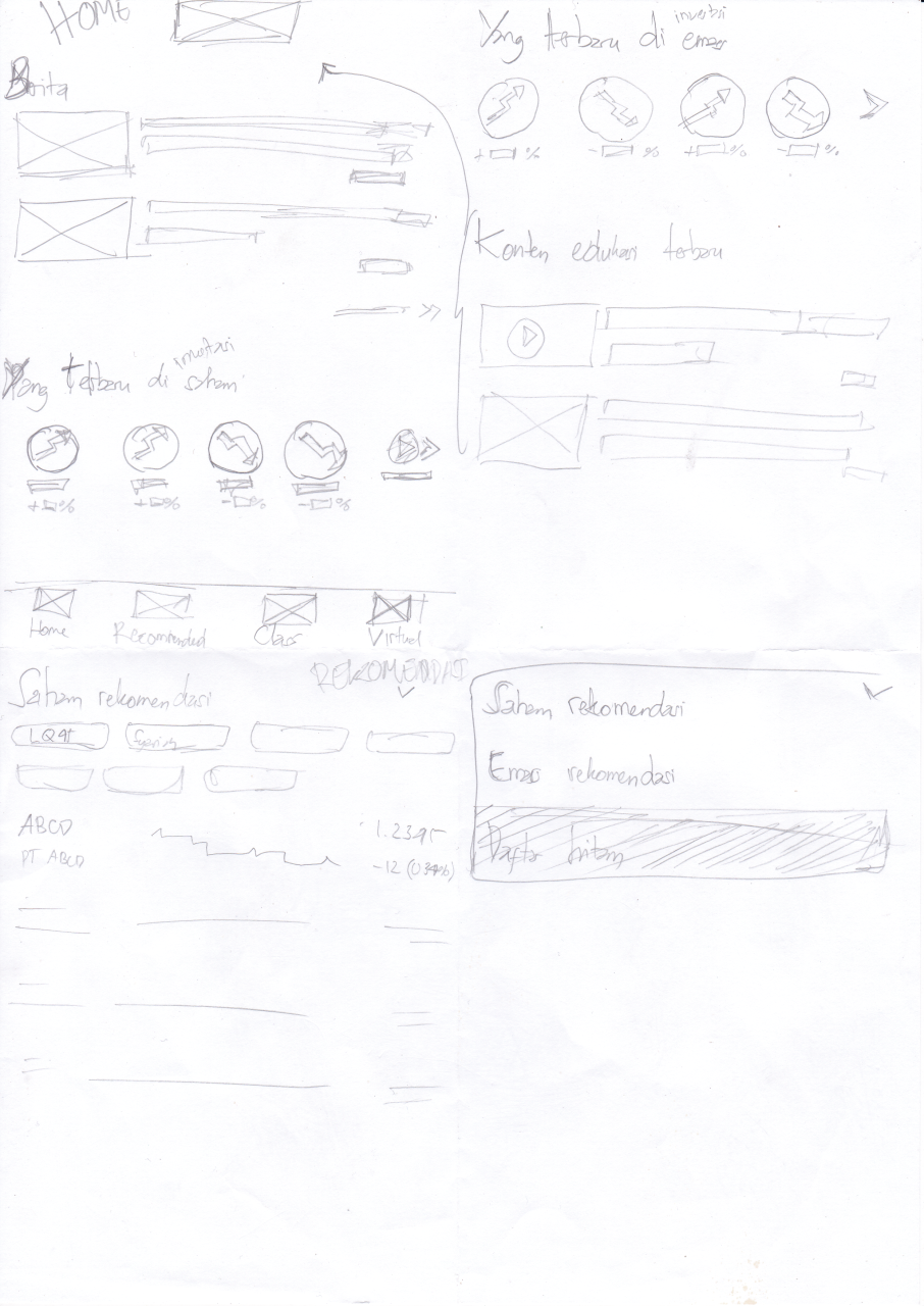
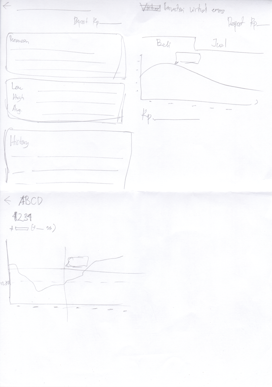
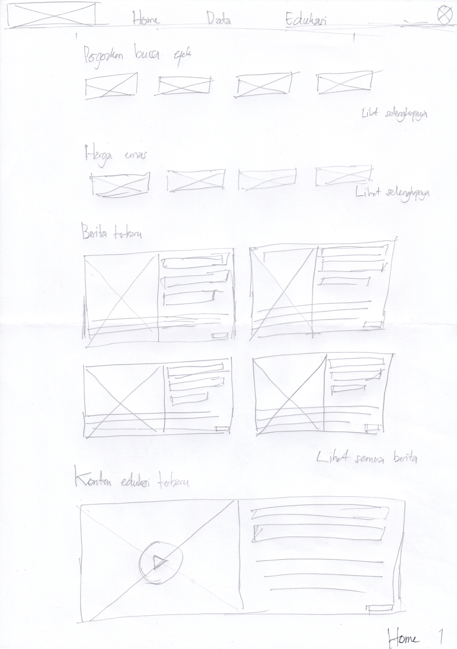
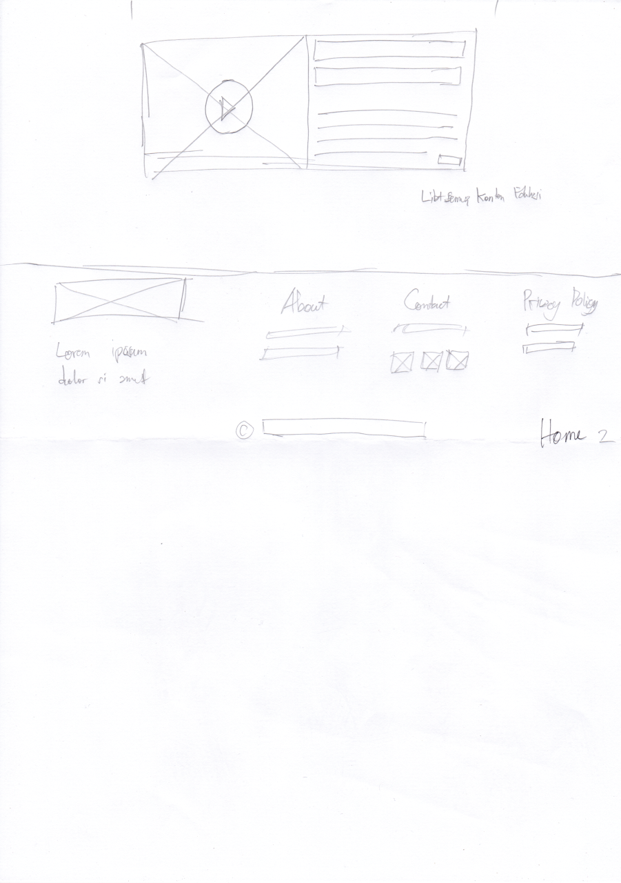
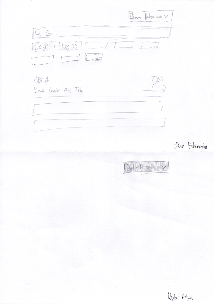
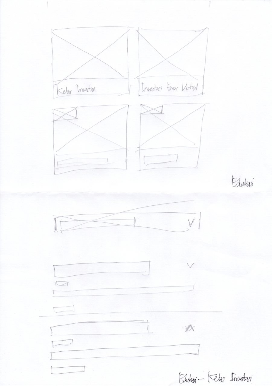
Every screen started on paper, so that whatever carried into the digital wireframes answered a pain point. Mobile and web were sketched separately.
03
Usability study
- Type
- Moderated, in person
- Location
- Indonesia
- Participants
- 3
- Length
- 20–30 minutes
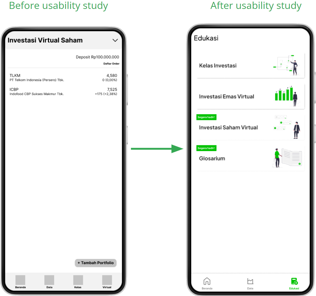
- VirtualParticipants couldn’t tell what the Virtual menu was for.
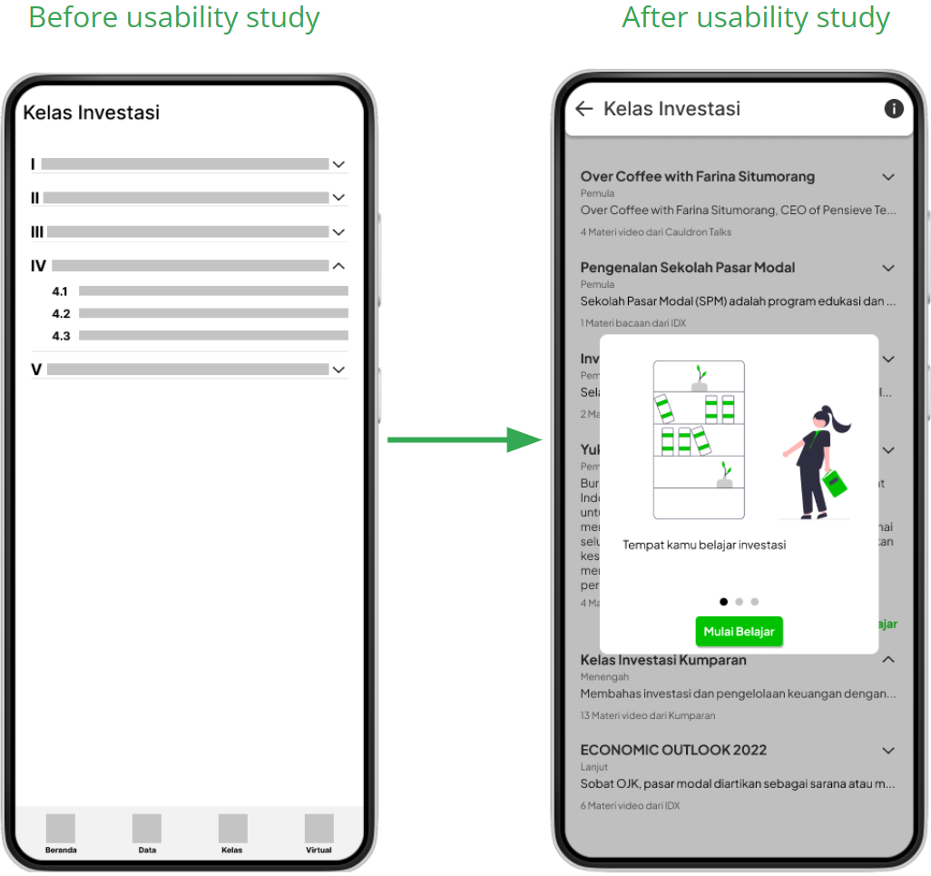
- KelasParticipants didn’t fully understand how the Kelas menu worked.
04
Refining the design
Virtual folded into Kelas
The Virtual menu moved into Kelas, split into a stock-exchange section and a buy-and-sell gold section.
An introduction to Kelas Investasi
Added an introductory prompt so first-time users know what the classes are before they start.
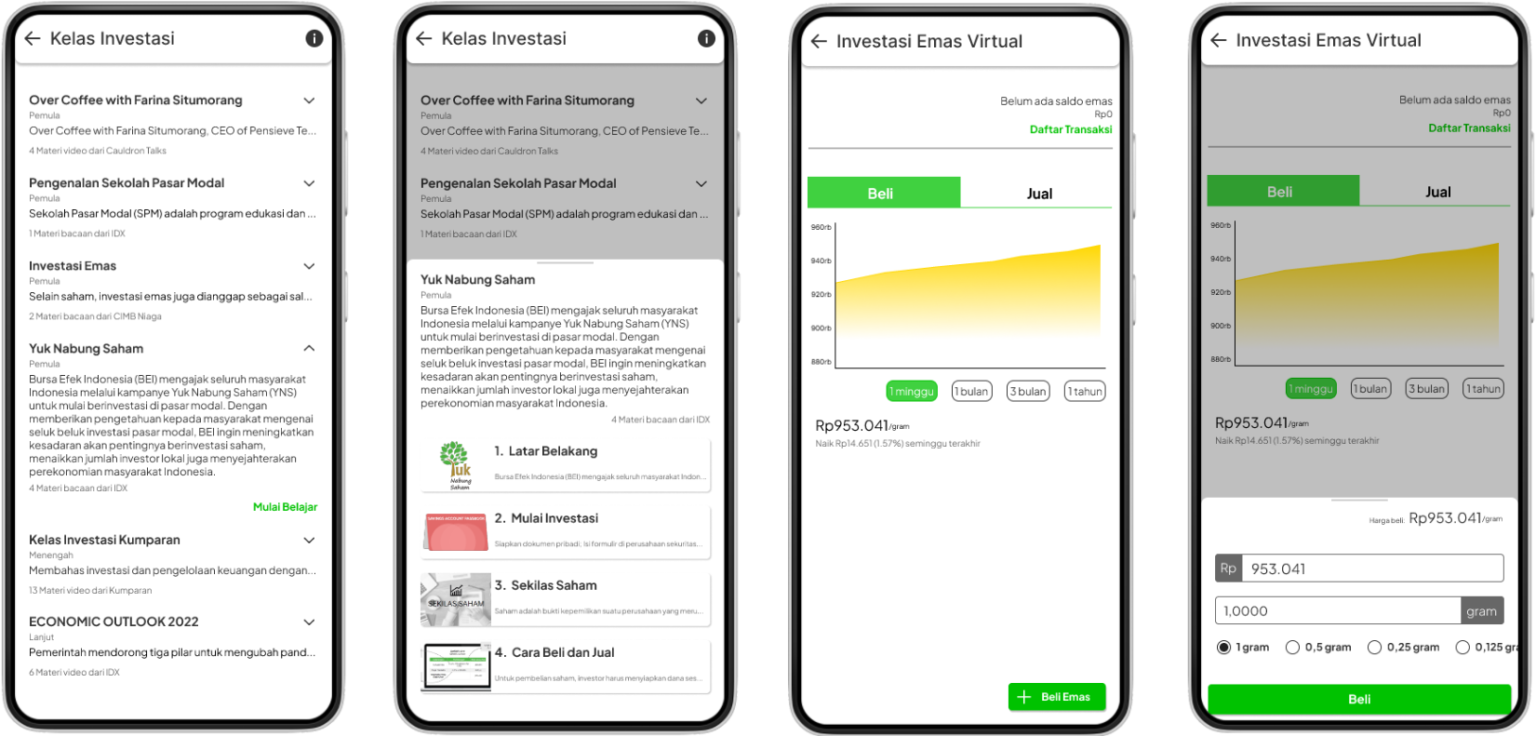
High-fidelity prototype
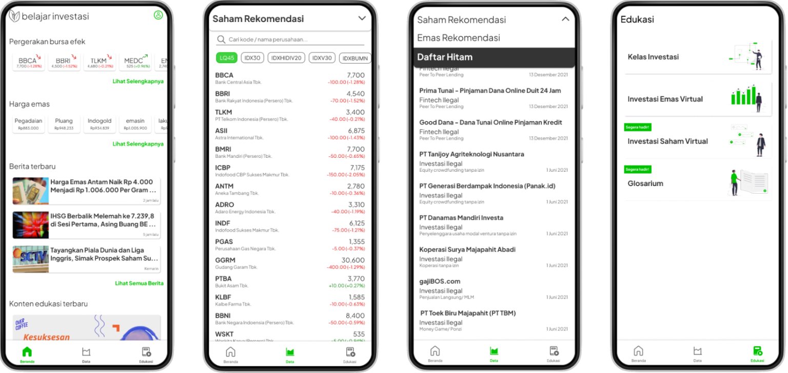
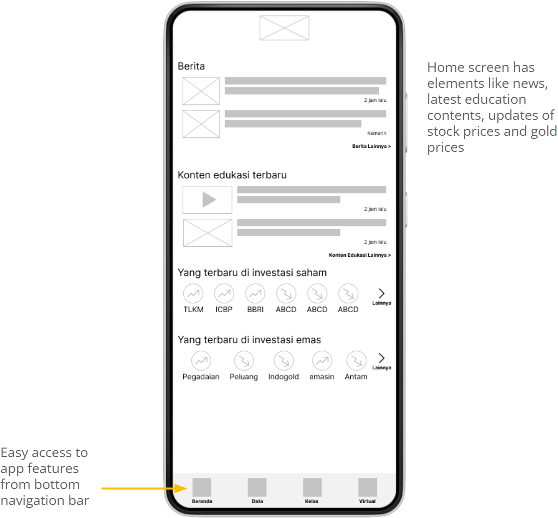
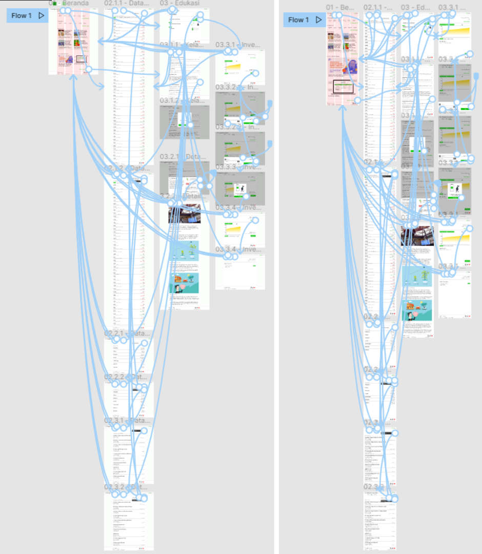
Follows the low-fi flow with the study’s changes. Virtual stock investing and the glossary were held back until more secondary research is done.
[FIGMA LINK: Open the prototype in Figma ↗]
05
Responsive design and design system
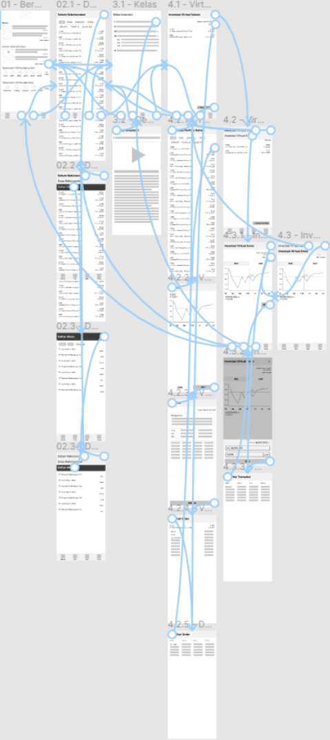
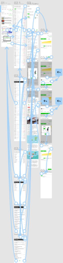
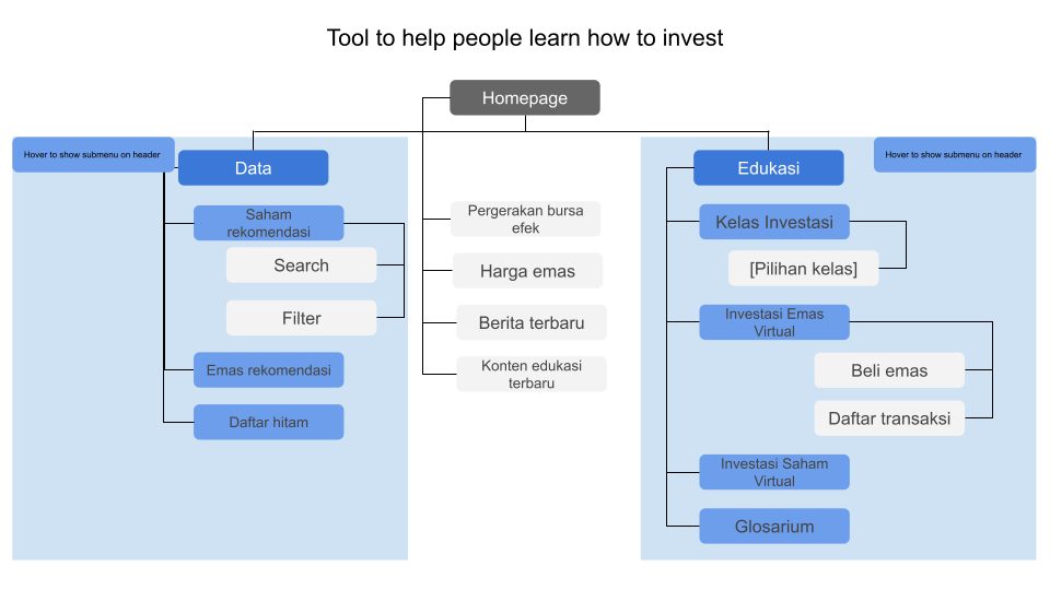
A sitemap set the structure for every screen across devices. The desktop and tablet sites follow the same flow as the app.
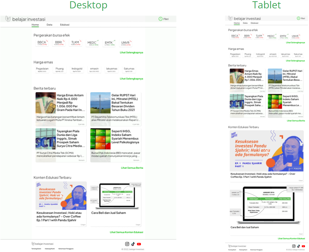
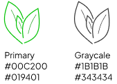
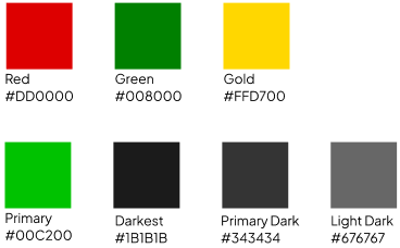
Typography, logo and colour sheets, plus a sticker sheet of the components that make up the system.

06
Takeaways
“It helps to educate (ordinary) people in getting to know investment.”
Usability study participant
Impact
Participants found the app useful, especially Kelas Investasi (online learning), Investasi Virtual (virtual investing) and Data (stocks, gold and a blacklist).
What I learned
A broad problem became manageable by taking it one design step at a time, each tied to a specific user need.
Next steps
- Usability-test the high-fidelity prototype.
- Secondary research for a better virtual stock-exchange environment.
- Finish the glossary with proper sources.