Concept · Product Design
Kontan Greeneration
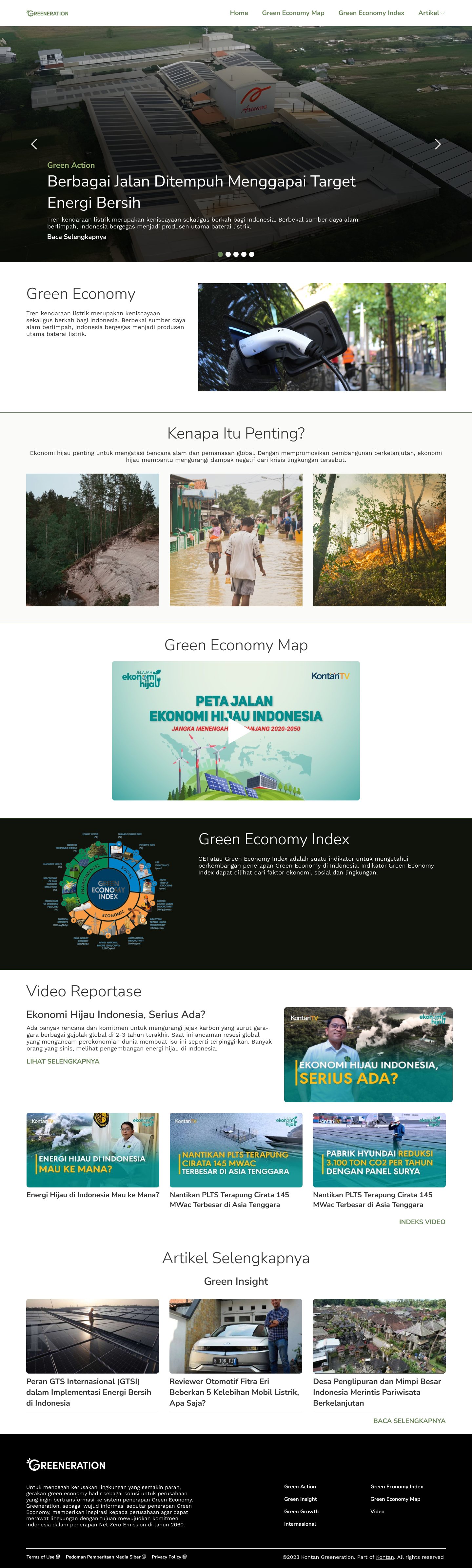
A green-economy news website concept that Kontan’s business team pitched to a client — Kontan reporting plus the client’s own content, for businesses with a strong environmental commitment.
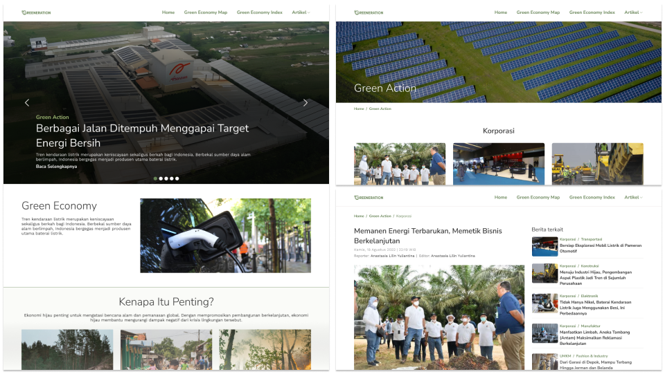
- Role
- UX designer, website concept for the business team
- Timeline
- 21 – 29 March 2023
- Platform
- Responsive website, desktop and mobile
- Methods
- Competitive assessment, information architecture, lo- and hi-fi prototypes, usability studies, accessibility
- Outcome
- A pitch-ready responsive concept in nine days, refined with the business team’s feedback.
Problem
Reference green-economy sites mixed link colours, opened new tabs for every subdomain and used confusing labels.
Goal
A website that clearly communicates why environmental preservation and sustainable practice matter to business.
01
Understanding the brief
The client wanted a well-organised site about companies with a strong environmental commitment, combining Kontan news with its own content. The business team shared references, including Kontan’s own green-economy page and a competitor’s green channel, and a competitive assessment of them set the pain points to design around.
- AccessibilityInconsistent link colours cause confusion and break the visual harmony.
- Navigation flowOpening new tabs for different subdomains interrupts the flow.
- ConfusionUnclear wording makes content categories hard to tell apart.
Design strategies
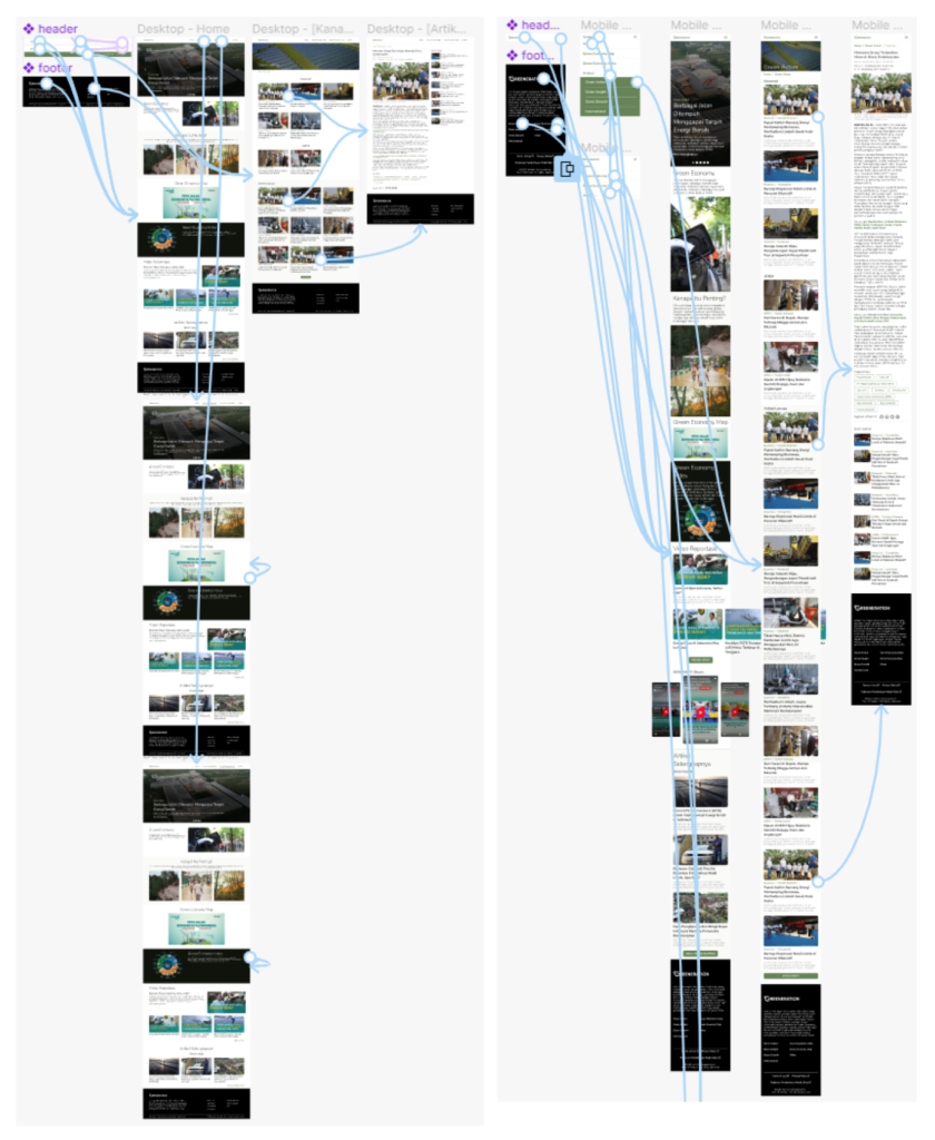
Clear navigation
Concise labels in a logical hierarchy.
Iconography
Icons make concepts quicker to digest.
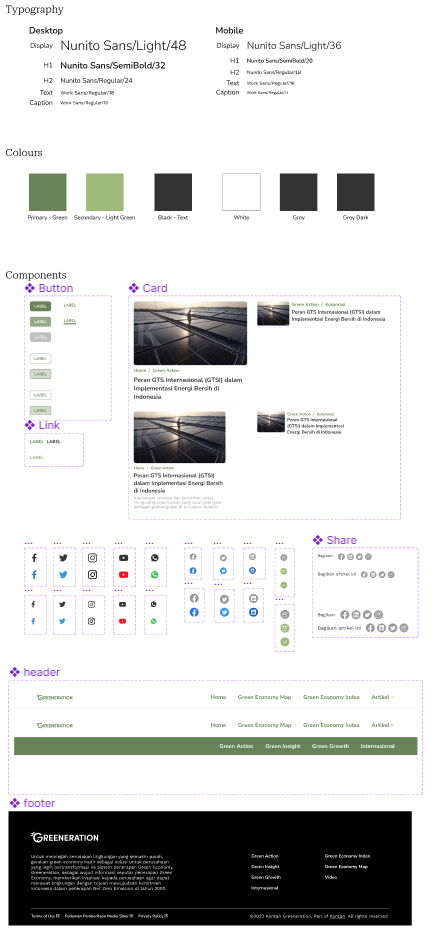
Consistent visual language
One system for type, icons and colour.
Earth-tone palette
Greens that connect the subject to nature, used consistently.
White space
An uncluttered layout that puts key information first.
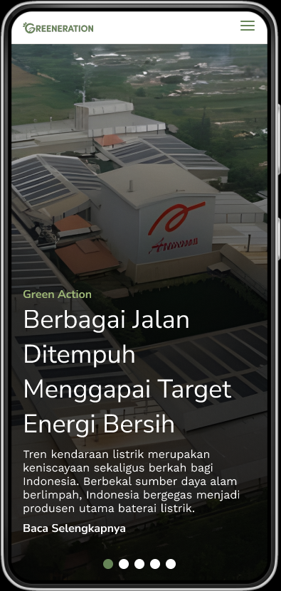
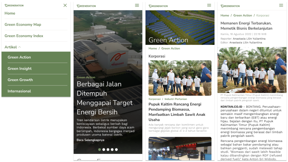
Responsive
Content that adapts to every screen size and orientation.
02
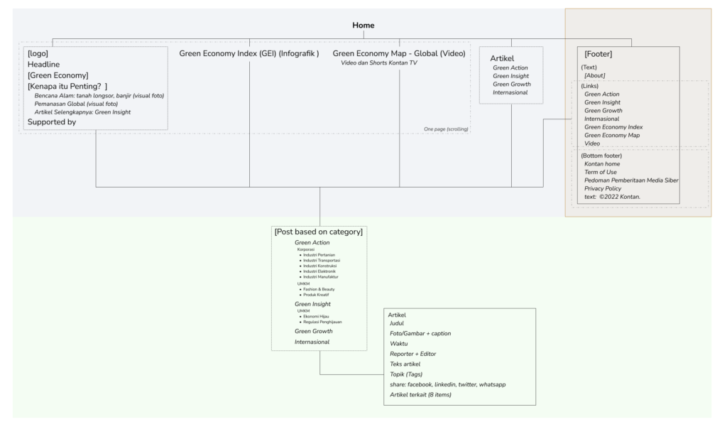
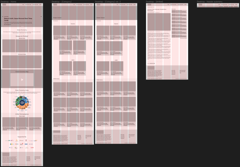
Starting the design
03
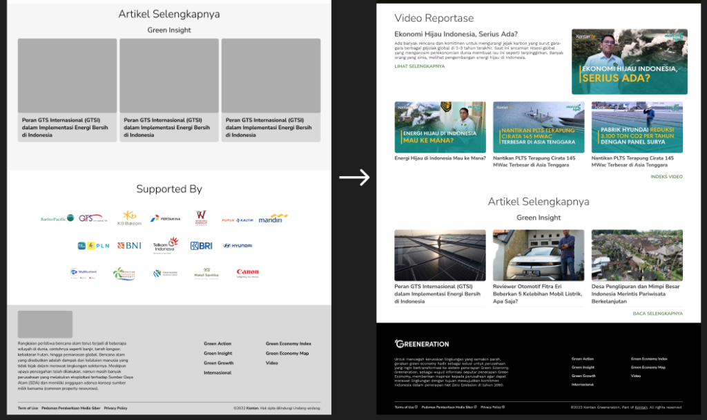
Refining the design
04
Takeaways
Consistent visual language
One system for type, icons and colour made the site easy to navigate and gave it a cohesive identity.
Responsive design
Designing for desktop and mobile from the start let the content adapt without compromise.
Collaborative iteration
Continuous feedback from the business team kept the design aligned with the client’s requirements.
Next steps
- Brand partnerships that match the client’s environmental commitment, to bring back a “Supported By” section with substance.
- Regular user testing to find remaining pain points and guide iterations.