Case study · Product Design
HIVI! Concert Merchandise App
An app for fans of the Indonesian band HIVI!, and for people buying merch on their behalf. During the project it grew from merchandise to tickets and bundles.
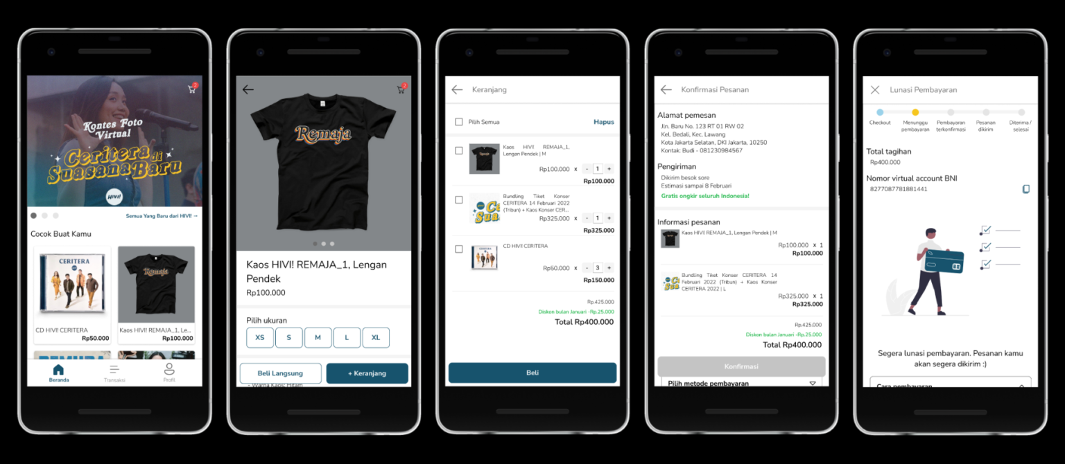
- Role
- UX designer, concept to delivery
- Timeline
- May 2021 – February 2022
- Platform
- Mobile app
- Methods
- Interviews, empathy maps, journey map, wireframes, lo- and hi-fi prototypes, two usability rounds, accessibility
- Outcome
- A familiar shop flow participants understood at once; scope grew from merch to tickets and bundles.
Problem
Official merch is expensive and hard to find online, and merch bundled with concert tickets is harder still.
Goal
Make buying official HIVI! merchandise easy, directly in the app.
01
Understanding the user
Interviews and empathy maps pointed to adults who want official merch without the hassle. Merch was expensive and hard to get, the buying process was unclear so people asked friends for help, and pre-orders and long product descriptions tripped them up.
- AccessibilityOfficial merch is expensive and difficult to get.
- ConfusionPeople ask others to explain how to buy.
- TimeSome items have to be pre-ordered.
- Error-proneProduct descriptions need careful reading to avoid mistakes.
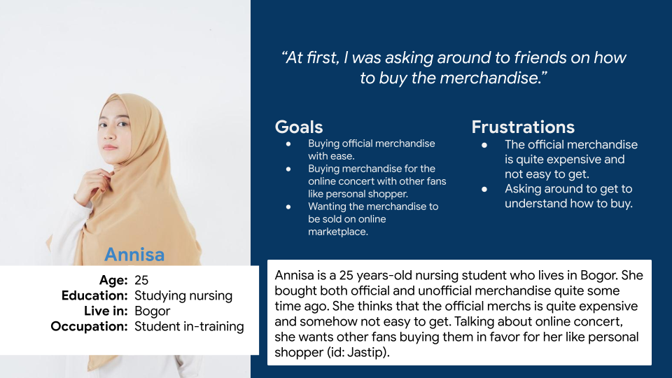
Persona · Annisa
A nursing student in training. She wants affordable official merch sold online, so she can buy it herself without asking others or using a jastip (personal shopper).
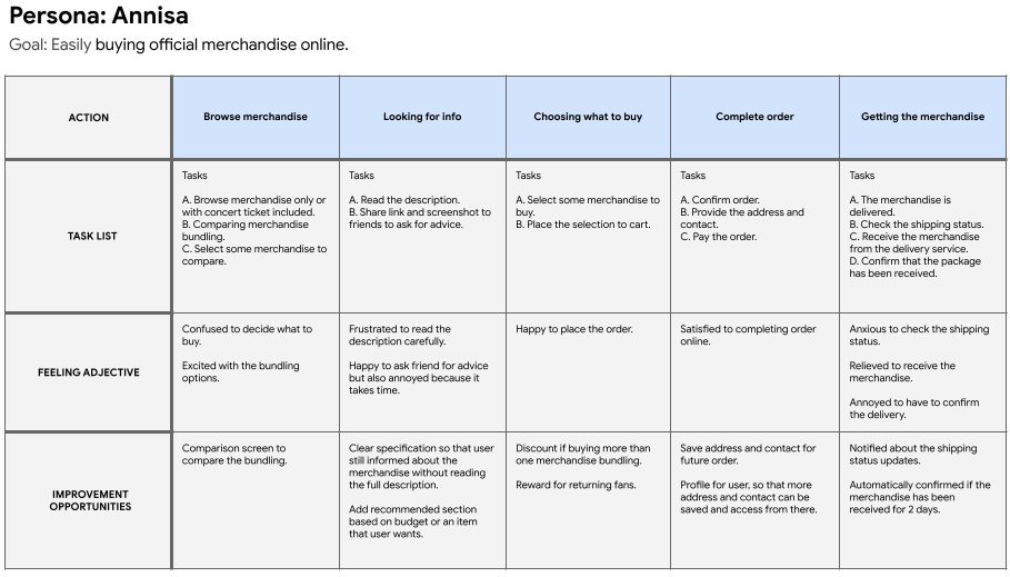
User journey
Mapping Annisa’s journey showed a dedicated HIVI! merch app would help.
02
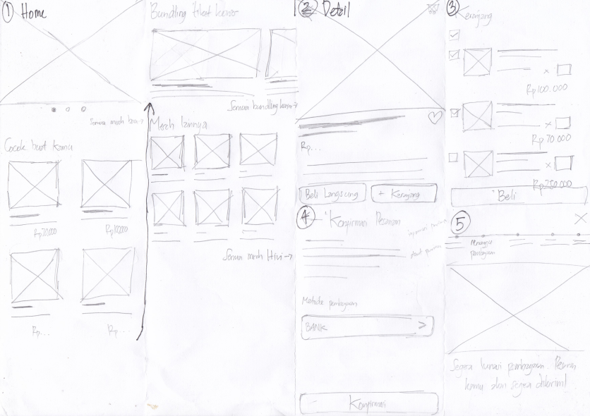
Starting the design
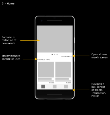
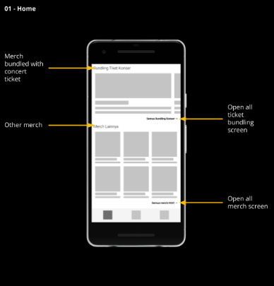
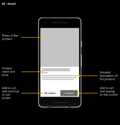
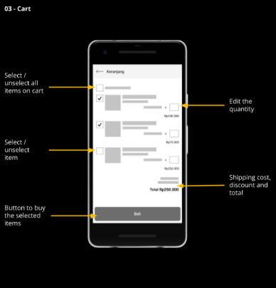
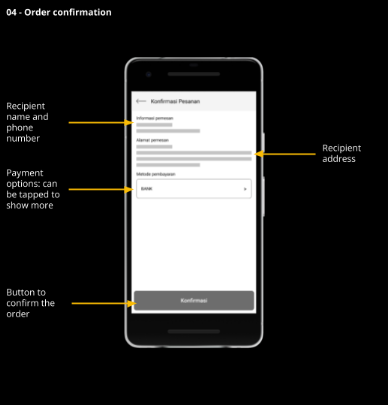
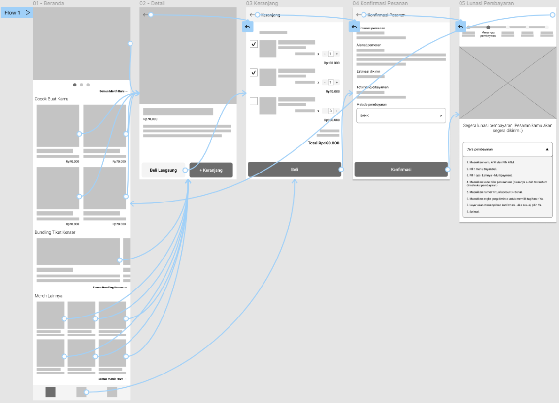
03
Usability study
Round 1
Moderated · remote · Indonesia
4 participants · 30–45 min
- People needed to edit item quantities.
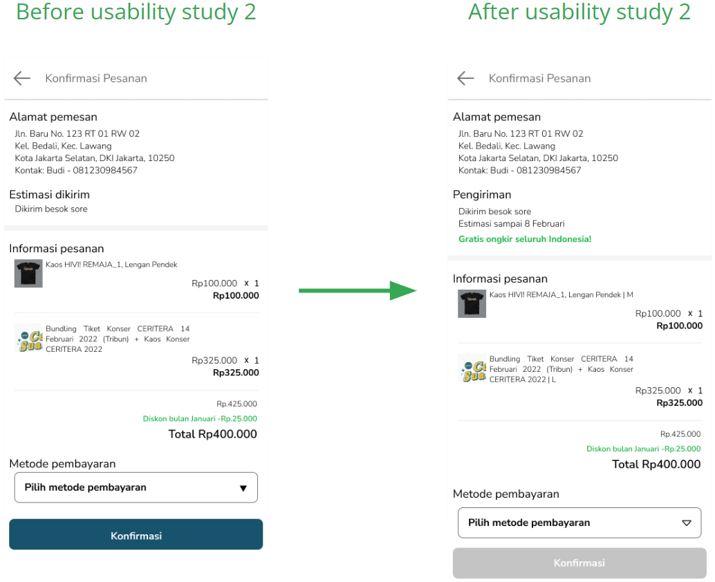
- The order screen needed more detail.
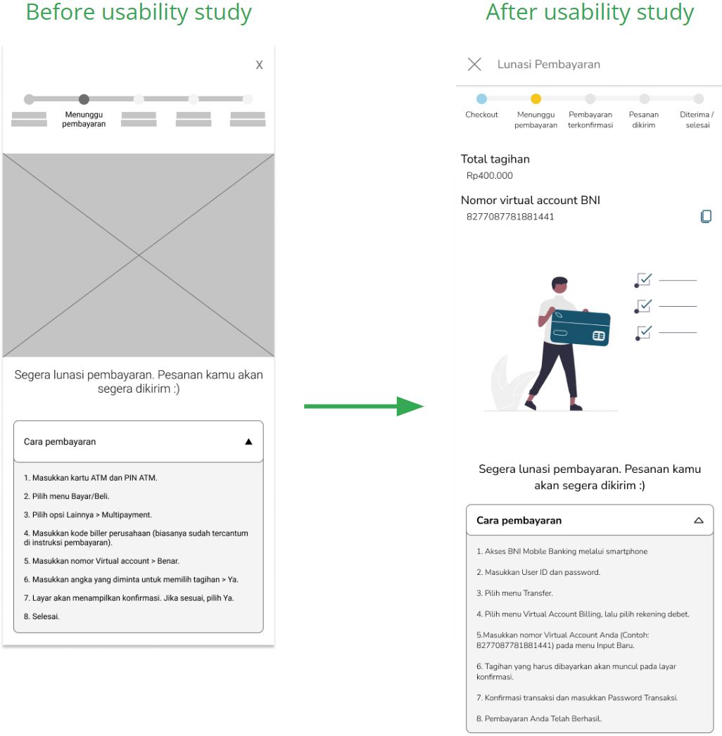
- Payment instructions needed clearer cues.
Round 2
Moderated · remote · Indonesia
3 participants · 30–45 min
- Checkout needs an estimated delivery date before payment.
04
Refining the design
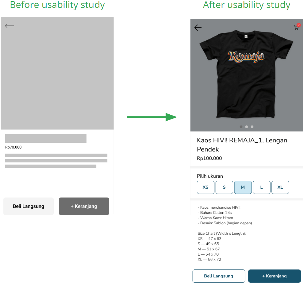
Product detail
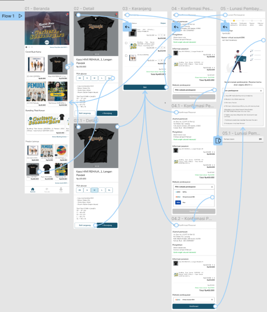
Pick a size where one applies, alongside name, price and description.
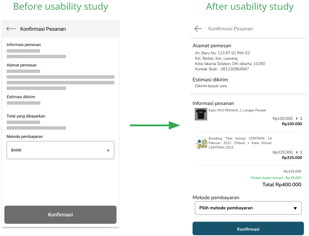
Order information
A payment-method dropdown, contact and address combined, and every checked-out item listed.
Payment
A total amount and a virtual account to pay into.
Shipping
An estimated arrival date and free-shipping text, from round 2.
05
Accessibility
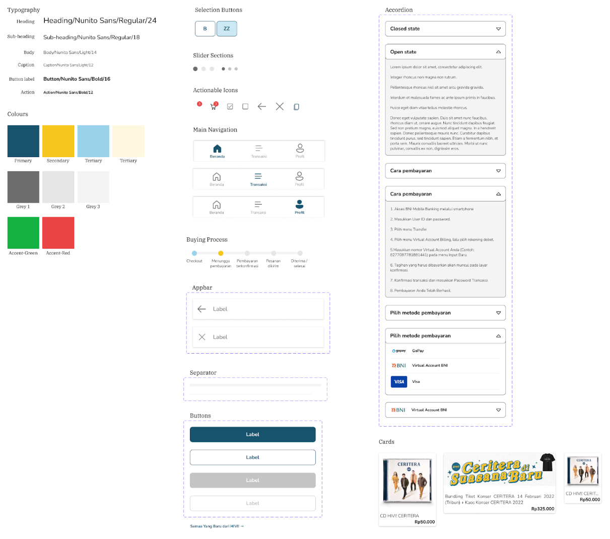
Important text is bold and set in a different colour, for people with low vision.
Distinct primary and secondary button styles make navigation easier.
Product photo, name and price read clearly without the full description.
06
Going forward
“The looks is familiar like Tokopedia, so it is understandable.”
The layout follows common e-commerce apps, so it felt familiar (Jakob's Law).
“Because it is not a marketplace, there’s no need for reviews. I just want what my idol offers.”
Fans want a straight path to official merch and tickets.
What I learned
The first idea was only a starting point; usability feedback and peer input drove the iterations. The scope grew from concert merch to anything the band wants to offer its fans.
Next steps
- Another usability round on the wider product range.
- Research with HIVI! fans only, to find new needs.
- Rebrand as TOKOHIVI!, in line with the band’s official store.